Tuesday, May 4, 2010

Color

My original idea for a Ning site was about how we would "see" a new color - What does it look like, how would we expect it to taste, would seeing it make us feel happy, or sad, etc. etc. Through my Ning site, the idea transformed a little bit when it became evident that the colors we see now are highly subjective.

Basically, we've got enough trouble as is with the colors we've got now.


Color is Subjective

Someone commented on my blog who is red-green colorblind :
http://acolorfullworld.ning.com/profiles/blogs/color-blindness

" The thing of it is, what I do see when looking at these colors is not a perfectly neutral gray or, as some people have thought, the object of color is completely invisible to me, but rather a different version of what everyone else sees."

Right from the start, not everyone is looking at the same colors.

I really liked how he wrapped up his comment :

"[Color] is rather subjective and is a surprisingly loose "structure" of definition to describe things that we, especially as visual people, put a lot of trust and confidence in."


-How can we trust that people see things the same?
-If people see things differently, how can we know that everyone sees our work the same?
-Is color a futile endeavour if no two people see it the same?
-What happens when we can't trust the colors we see in front of us? How do I know that what I'm looking at is what someone else saw when they made it?


We've been trying to quantify color for a long time.

In a world of subjective color, Crayola feels that it can successfully color our world with only 120 different crayons.

-The whole world, in 120 colors from Almond to Yellow-Orange.
http://www.crayola.com/colorcensus/history/current_120_colors.cfm
-How do you try and describe "Fuzzy Wuzzy Brown" or "Razmatazz" as a color? If there's only 120 of them, you'd better be carefull how you name them!


There's a real science behind the meanings of some colors
(From my Ning site - someone sent this to me)
http://www.infoplease.com/spot/colors1.html

-Some colors do have certain reactions within our brains.
-"While blue is one of the most popular colors it is one of the least appetizing. Blue food is rare in nature. Food researchers say that when humans searched for food, they learned to avoid toxic or spoiled objects, which were often blue, black, or purple. When food dyed blue is served to study subjects, they lose appetite." (From above link)

-"The most romantic color, pink, is more tranquilizing. Sports teams sometimes paint the locker rooms used by opposing teams bright pink so their opponents will lose energy."

Monday, May 3, 2010

Grading Notes

Work for grading DUE FRIDAY MAY 28TH

-New Media Artist Research
-New Media Artist Presentation
-E-Portfolio
-Generative Topic Teamwork
-Generative Topic / Individual Work
-Social Network Research
-Final Presentation
-Professionalism
-Attendance

Tuesday, April 20, 2010

More interesting Stuff

Watch the first two videos. The other links are so-so.


Check out this video of a mischievous Octopus.
I watched the beginning, and I was like "eh, another blurry underwater video", but the middle is really cool and serene, and the ending was like "WOAH" when things suddenly became brilliantly sharp and vibrantly colored. I think the music fits it pretty well too.

http://www.vimeo.com/10966874


This is an ad. . .And I can't believe I forgot about it while we were doing our presentations!
I think this best illustrates why you don't always want to re-touch photos too much.

http://www.youtube.com/watch?v=BcbZ0v8Mpvk


A Good use for the new Apple iPad
http://www.youtube.com/watch?v=Q9NP-AeKX40


A few links which I'll try and forward to the right people in our class who might find them interesting :


Both of these actually seem really important as we talk about social networking, and how much information about ourselves is floating around online - whether we know about it and want it out there or not.


"Google Street View Shoots Same Woman 43 Times"

The van with the camera that captures images for Google Street View was driving around at the same time (and about the same pace) as an English woman taking her dog out for a walk. Her husband found her on Google Street View 43 separate times.

http://news.cnet.com/8301-17852_3-20002799-71.html


Google and Library of Congress to Archive All Public Tweets

I'm not much of a Twitter fan. I think I want more then just 140 characters to say what it is I have to say, and its nice to add in pictures and links now and then. I'm tempted to move to Plurk, which is like twitter, Facebook, and instant messaging combined; You can post things, and your friends can comment on them, right on your page - So you can post a photo, and then watch/read your friends comments on it like a conversation.

I think that its an interesting idea to archive the public tweets, since there is a LOT of information conveyed by them - like when Obama was elected, I bet there were millions of people tweeting about his victory. A quote from within the article states

""Expect to see an emphasis on the scholarly and research implications of the acquisition. I'm no Ph.D., but it boggles my mind to think what we might be able to learn about ourselves and the world around us from this wealth of data," wrote a Library of Congress representative in a Facebook note."


What I'd like to know is how exactly they will be archived - For instance, If I have a tweet that I suddenly decide I don't want to be public, and I change the privacy settings on it, what happens? Does it get deleted from the archive? (I don't even know if you can set privacy setting for individual tweets, so it might be a moot point.)

http://money.cnn.com/2010/04/14/technology/Google_Twitter_archive/

Ning

The more I use Ning, the less I'm liking it.

Here's the link to my Ning network

http://acolorfullworld.ning.com/


I like the idea behind Ning, but I think Blogger is just as powerful (for the most part), and its much more user friendly. I think Blogger also has more powerful built-in tools, but I'll see how Ning does.

Tuesday, April 13, 2010

Some more stop motion to check out

Watch both of these on their respective sites;
The Youtube one should fit on screen, and I've got a higher resolution version of the one on the bottom too.


How Not to Paralel Park (V. 2) from Mark Sylvester on Vimeo.

Monday, April 12, 2010

Process

Topic Presentation Question:

is process an important part of creating artwork?


(actual typed conversation transcribed by Rachael Kulik)

RACHAEL: The process is definitely important when creating an artwork. I personally am process oriented, and tend to work and build as I go. I’m not usually a fan of others seeing the process beforehand – only the final product- but it’s still pretty important to get to the final product. Not to mention the process changes the piece entirely, whether you start out with an outlined drawing or just go draw for five minutes without thinking. Whether it’s a little or a lot, the process is still important to the piece.

MARK: I think that the process is important for new media because it shows whether or not the artist made distinct choices or just used premade decisions from the technology available to them, you know? It really lets you show how much work the artist put into it. Did you actually spend time toning and balancing a photo if your making it sepia or did you just quickly do it in photobooth where it looks like your dog peed on it instead? There’s the actual thought out way where your thinking about it and paying attention, and then there’s the quick-and-easy-do-it-in-two-seconds-on-your-computer-and forget-about-it-way.

DANIELLE: So, I think process is important because it shows how the artist thinks, and it shows the choices the artist goes about how they’re going to complete their artwork and how somebody chooses to complete a task, whether it be washing the dishes or doing a project for a school paper. For example, someone might use a reference photo instead of a still life or model to do a drawing or a painting. It might not seem that important when looking at the final product, but I think that depending on which one they chose, it affects the drawing or painting.


Artist Examples:

Glenn Feron


http://www.glennferon.com/portfolio1/index.html

One thing we found interesting about Glenn Feron is his interaction with the before and after process for doctoring photographs. These days, airbrushing photos is important for the industry. We live in a world surrounded by aesthetics and supposed ‘perfection’, in turn causing problems with those growing in the modern day society. It’s interesting to see the differences between the old photos and the new photos – some small, like a color balance change, and others larger, like eliminating wrinkles or ‘fat’ curves from the body (in some cases, even adding a few!) We found it interesting to see the before and after process with these photos, and loved being able to interact with them. They really get you to start thinking. Check it out for yourself - see what you think.

George Vlosich III


http://www.youtube.com/watch?v=nYM__s3R5q0

George Vlosich creates artwork using an etch-a-sketch. We found his artwork interesting because the process is SO essential in creating the work itself. If you shake the etch-a-sketch, you essentially erase the whole entire piece. Plus, creating it takes such patience turning all the smallish knobs to follow the important linear components. However, if the viewer had no possible idea that the etch-a-sketch was such a temporal medium and had they not seen the entire process of creating the piece, we would only have a still image of basketball player that doesn’t nearly strike us as hard as knowing it’s created using a simple child’s toy.

Kseniya Simonova


http://www.popeater.com/2009/08/28/ukrainian-talent-winner/?icid=mainmaindl2link4http://www.popeater.com/2009/08/28/ukrainian-talent-winner/

For this example, the process of creating the work IS the piece itself. There’s so much that goes into her work - The motion of her hands, the background music, the sound effects, and the lines and shapes her hands create. One could take still pictures of all of her pieces, and it would mean absolutely nothing unless you saw her actual creation OF it. Her pieces themselves actually speak so much more than making a simple aesthetic piece. Her work stands for the pain and suffering her country has faced and survived. Without any of the other added components and without documenting the process, her work would not nearly hit anyone the same way it currently does. Can you imagine making an artwork out of the actual PROCESS of creating it? Talk about interesting!

Process Question

How does process affect the final product?

Looking at the artists and their works above, how do you think process affects the final product? We chose a few really thought provoking artists to help get you thinking about the concept. You can find a lot of resources about the artists by accessing youtube or even wikipedia. A lot of times the actual process can be overlooked when it’s actually such an important component. We've included a few good links for the artists, too.


Kseniya Simonova:

http://www.kseniyasimonova.com/

http://artisticthings.com/sand-animations-with-kseniya-simonova/

http://en.wikipedia.org/wiki/Kseniya_Simonova

http://www.bareknucklevideos.com/video/o0xnLvk8xW4/Sand-Artist.html

George Vlosich III:

http://www.gvetchedintime.com/gvetchedintime/index.php

http://www.cleveland.com/tipoff/index.ssf/2009/01/tipoff_george_vlosichs_etch_a.html

http://hubpages.com/hub/The-Etch-A-Sketch-King-George-Vlosich-III

http://www.veoh.com/collection/PeerSientje/watch/v6259925f9GcbjWc

Glenn Feron:

http://photoshopdisasters.blogspot.com/2009/08/glenn-feron-i-have-no-sense-of.html

http://ocaoimh.ie/glenn-feron-the-art-of-retouching/

http://www.linkedin.com/in/glennferon

(more of glenn's work can be seen on his portfolio at his website: http://www.glennferon.com/portfolio1/)

Tuesday, March 23, 2010

Class Notes 23rd

Really Interesting link about sinage and other
http://www.slate.com/id/2245644/


http://en.wikipedia.org/wiki/Semiotics

http://www.slate.com/id/2246104/

http://en.wikipedia.org/wiki/Pragmatics


It's an all-blue house (Going back to the idea of relationships about color and feelings.)

http://www.thesun.co.uk/sol/homepage/news/article2374671.ece?OTC-RSS&ATTR=News

Tuesday, March 2, 2010

More Singers

Okay, these singers came to mind while reading/thinking/talking about my last post.


Max Raabe

This is a german singer who does 30's songs - in both German and English, in true 1930s style.
His english inflection is REALLY good. I love the showmanship from 30's music, and the sound. . .its just so vibrant and lively, and makes you want to get up and dance.


This is an example of his singing in English. I like it, but its not my favorite English singing that he has done. Saving the best for last here ;)


\\


Max Raabe has also done a series of remixes of "modern" songs done over in a 30's jazz/swing/club style of music. A number of them I like better re-done in 30s style then I do the original songs. . . . .


And, another 80s throwback here, Scatman John.


I love his singing and the video because its just. . .totally random, but it somehow seems to all make sense at the same time.


I think that he was the first artist to combine scat singing with modern music, and I just love the fusion that came from it.

Saturday, February 27, 2010

Another random find

Found this while trolling for links and stuff.

I'm still not sure what to think of it; I can't seem to find much on the singer, or this video. It seems like he was a good Russian singer, and he's probably lip syncing to himself in the video.

I'll update when/if I can find some more information.


Tuesday, February 16, 2010

Audio Commentary

I don't think that all of these are all exactly as complex, or "loaded" as some of the clips you showed, but they're just as cool.


For your consideration, I present :


"We are All Connected"
This is one of my favoirites, since I love the ideas it plays with, and its use of different "famous" personas. I also think the paralell between various scientist creatig a functioning whole from many unique parts mimics the way the universe works - one gigantic whole made from billons and billions of parts.

""We Are All Connected" was made from sampling Carl Sagan's Cosmos, The History Channel's Universe series, Richard Feynman's 1983 interviews, Neil deGrasse Tyson's cosmic sermon, and Bill Nye's Eyes of Nye Series, plus added visuals from The Elegant Universe (NOVA), Stephen Hawking's Universe, Cosmos, the Powers of 10, and more. It is a tribute to great minds of science, intended to spread scientific knowledge and philosophy through the medium of music."


Here is another world-traveling one : "Where The Hell Is Matt?"
I love the visuals of this one :)


Ghostbusters Multi-track.
(I just like how the final version sounds on this one. . .yeah, its a bit of a hack, but in my opinion, a nice-sounding one. And the video is pretty cool too!)


On the "strange instrument" track, check this out : The Megabass Waterphone


The Stop Sign Musical Compilation

Maybe another hack, but its fun to watch anyways.


Its required of me to include a cat-themed post.


Notes from end of class :

-"Harvested" vs. "Created"
-"Material Presence"
-"Real-Time" - tweaking, making, manipulating? Is "real-time" really REAL time?
-"Time" - both a cycle, and has life, death, implications as an aestetic.
-"Scale" - Be both an autonomous individual and universal, global action.
-"Democratic Moment" in time - democracy itself is part of the art education dialog.
-"

Tuesday, February 9, 2010

Fishing for Links!

Doing some digging around online (dare I call it research?)


Best summation of my idea on why Mr. Stimpsons work is art :

"Lego is seriously one of the building blocks of life. We’ve got Carbon, we’ve got Hydrogen, and then we’ve got Lego. It should have it’s own atomic symbol and everything. There isn’t a single person I know who doesn’t have childhood memories of sitting on the living room floor building something out of Lego blocks."


http://shapeandcolour.wordpress.com/2008/04/01/mike-stimpson-classics-in-lego/

I buy that statement. I've got loads of legos at home, some of them still put together in sets, some sets still in pieces that I'll probably never get around to repairing and putting back together.


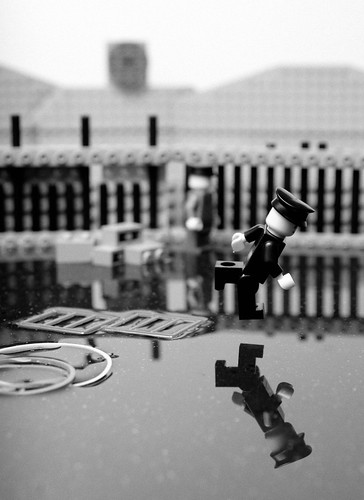
Take a basic building block like Lego, and mix it with iconic, maybe even defining moments of human history, and you've got a wonderfull work of art. A photograph can be viewed as a record of an event, and each moment a photograph captures is itself a small part of a bigger picture. For instance, the picture of a navy sailor kissing a nurse on VJ day is a mere snapshot of what happened worldwide that day. There were other events that happen across the globe on that day. The picture is only a record on two people, for less then one second, on that particular day. It is an important photo, but what it captures is only a small part of the happenings of the world on that day. That snippet of time is just like a tiny lego block - it is but a mere part of what happened on that day. The same can be said for the image in a cultural context. It is one of the first images that comes to mind when people think of VJ day; It is the defining visual moment that people associate with that day, and that event. Think of the power that world war two had, and all that happened. And people remember the end of it all by one single photograph. One photograph represents the end of years of war, hundreds of thousands of deaths, and the re-shaping of the "modern" world.

There are also other connections that can be made between real people and lego people. Lego people don't move; It takes human intervention for them to walk, talk, dance, drive, etc. Or, at least, no ones seen them do these things on their own. . .yet. . . .The same can almost be said of photography. Beautifull images exist all around us, all the time. The way someone leans over in front of a computer, or the way light filters through the window blinds as a cloud passes by. These images are fleeting and beautifull, but they don't exist, and can't be shown and shared unless someone actually takes the picture. The potential is there, but sometimes it all comes down to recording it for others to see.


I found some supposedly "better" versions by another photographer

http://www.cefvigo.com/galego/galeria_vilari%F1o.htm

I don't like them at all. Stimpson leves his lego figures in "standard" lego configuration; He doesn't change their proportion at all, and leaves them as Lego designed and built them. This guy sort of creates new lego figures that I don't like.

Here's a comparison.

Stimpson (whom I like)


Mr. Virlano (who I don't like)


And, just for yucks, the original Robert Cappa Photograph


Now, neither rendition in Lego looks particularly human. Neither lego "figure" turly captures the pose and the anguish that the spanish soldier is in as he falls. But what in the world happened to the guy in Mr. Virlanos photograph? His leg is angled with sharp points in it. His head has this wierd ear thingy on it, and his arms are totally out of lego proportion. Mr. Virlano doesn't follow the established traditions for rendering lego people. His person doesn't look lego, but hes way too blocky and shapeless to be human either. Its okay to use Legos, and the traditions and connotations that go along with it, like Mr. Stimpson does. But when you distory it like Mr. Virlano does, the only thing I think of is "Boy, that guy cheaped out and got lazy making a human figure." There's nothing that connects his use of lego with his photographic reproduction. As far as I can tell, he used lego cause it was cheap and easy, not because he actually WANTED to SPECIFICALLY use LEGO.

(SEGWAY - This is now making me think about different ways to render/show the human form, from classic painting, to these lego people, to XKCD's stick-figures, and on. . .it would be cool to curate an exhibit solely on different ways to render people. I'll post a blog entry on this alone tomorrow.)

-Traces/Tracing - the term of conbining meanings from two different cultures/subtexts, and the creation of a new meaning that calls upon an unerstanding of both subtexts to create a new text.

Tuesday, February 2, 2010

Syllabus Changes

I'm noticing an interesting occurance about new media artists : Not all new media artists are "working" artists. Some of the new media videos/projects I've got bookmarked are one-off things; People do something good, post it, and thats it. They don't get gallery shows, or reviews in fancy magazines. Maybe its time to re-think the idea of what makes a professional artist?

Marks List of possible artists :


Playing For Change
http://playingforchange.com/journey/introduction

I first found this group through this youtube video, which was realy cool.


I like their ideas that music can be this universal worldwide tie-in that connects all people, and I think their project is particularly well-suited to new media, and the internet is continuing to spread worldwide and reach a larger and larger audience. Some of their work is also borderline doccumentary, giving musical artists/cultures a way to get recorded and archived for the future.


Eepy Birds
http://eepybird.com/

I remember hearing about these guys back when it became a fad to put mentos in diet coke and watch the rather explosive reaction that followed. Actually, these guys WERE the fad - they pretty much started its most recent incarnation. Anyone who can take a bottle of coke and a candy and make cool performance art from it is cool. Period.

(View video here)

http://revver.com/video/27335/extreme-diet-coke-mentos-experiments/

Their latest work has involved sticky notes, but I'm not sure they've really done much since. . .

Eepybird's Sticky Note Experiment from Eepybird on Vimeo.

From the creators of the Diet Coke and Mentos experiment, EepyBird show us how to have fun with sticky notes.


Mike Stimpson

http://www.redbubble.com/people/balakov


Mike makes re-creations of famoust artwork (mostly photographs) in lego.

I like these two, since they represent a range of complicated to simple renderings.
I love the idea of high art being rendered in a childrens play medium.


FEB 2
3 artists - your interest to : jhall@massart.edu
-Start collecting info on chosen artists

-Artists Name
-URL with their work
-Why did I pick the artist?

-Check out steve wilsons link list (from class babel page) - Good place to get ideas

FEB 9
(Probably a work day)
Research includes citations
1)Web resources
2)Massart Databases

Feb 16
-Present your artist

Like/Dislike

I'm not sure how I feel about this idea of replacing like/dislike with have access to / don't have access to.

As an artist, I understand that sometimes it takes time to develop ideas and connections, and "I don't like" can be a turnoff to understading a work (even if, in the end, you don't like it.)

But sometimes I just wanna scream @ an artwork because I just don't like it. I don't want art to become this culture where no one likes or dislikes anything. I don't want an audience of yes men (not the artistic movement/group, the plain old business kind of yes men). I want people to say that "I like this" and "I don't like this." I want people to go back to looking at art BECAUSE they like it. I hope they look at art they might not like for understanding, but art should be made because you like to make it and hope people like to look at it.

As art educators, I understand the need to avoid "I like / I Don't Like", but as artists, and viewers of art, sometimes I think its a dangerous road to head down.

Sunday, January 31, 2010

(NEW edits @ the end)

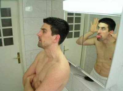
I really like some of the ideas that Levin is playing with in his work. As an overall concept, the idea of making art out of our reactions is a really cool concept. Its like looking in a mirror, and having the mirror wink and wave back at you while you stand there with your mouth hanging open in surprise.


Image From
http://zrooglepic.blogspot.com/2009/01/magic-mirror.html


I would certainly consider Levins robotic work as art. Even though it relies heavily on computers and robots, there is an artistic element to it. There is no difference in my mind between someone who does interpretive dance, abstract painting, or robotic creations, as long as the end goal is to produce some sort of reaction or response within the viewer. Advertising is designed to make people want to buy stuff. Interpretive dance can show anything from feelings and emotions to the movements of animals and nature (ala Lion King on Broadway - the youtube clips I've seen look amazing.) It doesn't matter what the means are, its all art. Just because he works with computers and robots, I don't consider his work to be any less art then any other more "traditional" types of art.

As a critique of Levins work, I would say that hes succeeded in playing with some cool ideas, but that they're not quite as finished as I'd like them to be. For example, his eye that blinks when you do. I like the idea of a single eye that watches you, and blinks after you do. Its a really subtle, but interesting way of looking at the human body. I'd call it a form of live self-portraiture. What I don't like is the way that his eye is displayed. I know that a lot of computer exhibits I've seen are sort of just placed on a table with a black tablecloth, but thats not good enough anymore. I want to see more then just a black box with an eye in it. I'd want to see it installed in a black wall, floor to ceiling, with just the eye mounted in the center. I mean, the eye is focusing on you, so why not make it easier to focus back on the eye? The other thing I might change is the sound of the eyelid blinking. I couldn't tell from the video if its just the plastic hitting the frame, or what. I assume the noise is there partly so you can tell the eye blinked, but I'd be interested in finding a better/different sound to represent a blink. I'm not really sure how I'd audibly represent a blink. . .maybe hair across a sheet of paper? Maybe a little air piston blowing a puff of air?


I have similar feelings for his second robot. I know that his goal was to try and create a robot that acts like its surprised to see you in gesture, but I'm not sure the googley eye on helps the idea along, or hinders it. In general, the human eye is one of the biggest emotional cues on the human face. I'd love to see his robotic eye from the blinkey-eye modified to fit the surprised robot arm, and have the eye get a mechanical eye lid to squint and stare intently at passers-by.

I'm not sure that the idea of showing surprise through gesture is coming though, or if it just looks like a rather surprised robot arm with a googley-eye covered in a plastic tube. The gestures are good, but I'm not sure the level of finish and finess on the rest of the installation is what I'd expect. Its like the difference between these two :


They're both smiles, but one says a lot more then the other.
I think the surprised robot arm is closer to the yellow smiley. Its a good idea, but its not that refined. I might actually be more impressed with it if I could see that there was a robot arm under that black plastic, and that it was carefully programmed to act surprised. What happens when you overlay the very human idea of surprise onto the skeleton of a machine that supposed to be precision-driven and computer controlled (that should, at least in theory, never be surprised, since it only encounters known conditions)?

I'd want to see the robot arm like this on the smiley scale (if it went from plain yellow/worst smiley to mona lisa/perfection)


Edits/Clarifications/More Stuff

Yellow smiley scale = seemed like a good idea at the time. . . .I think it would be a cool idea if I actually found 10 smileys to create a full scale of "meh" - "AWESOME!!!!"

Thinking a bit while on the train, I got a much clearer idea of what I was thinking about yesterday. There is a robot under that black plastic covering. I'm not sure if I think that the fact that its a robot should be hidden, or exposed and featured as a design aspect of the artwork.

On one hand, having a creature that acts surprised is really cool. But how far do you go making it look like a real creature? Should it have a real eye, and a fancier skin? If you go too fancy and animal-like, do you end up with something that looks like it should have come from Disney world? Is the identity of the robot important, or are the meanings conveyed through the gestures supposed to be the focus of the artwork?

On the other hand, you could just leave the robot exposed. Leave the robot as a robot. Let a mechaical aparatus thats designed to be programed and scheduled have some robotic "fun" and be surprised for a change.

BREAK

THIS IS BLANK